
Case study · Identity, website, communications
HM Tech:
from visual identity
to all communications
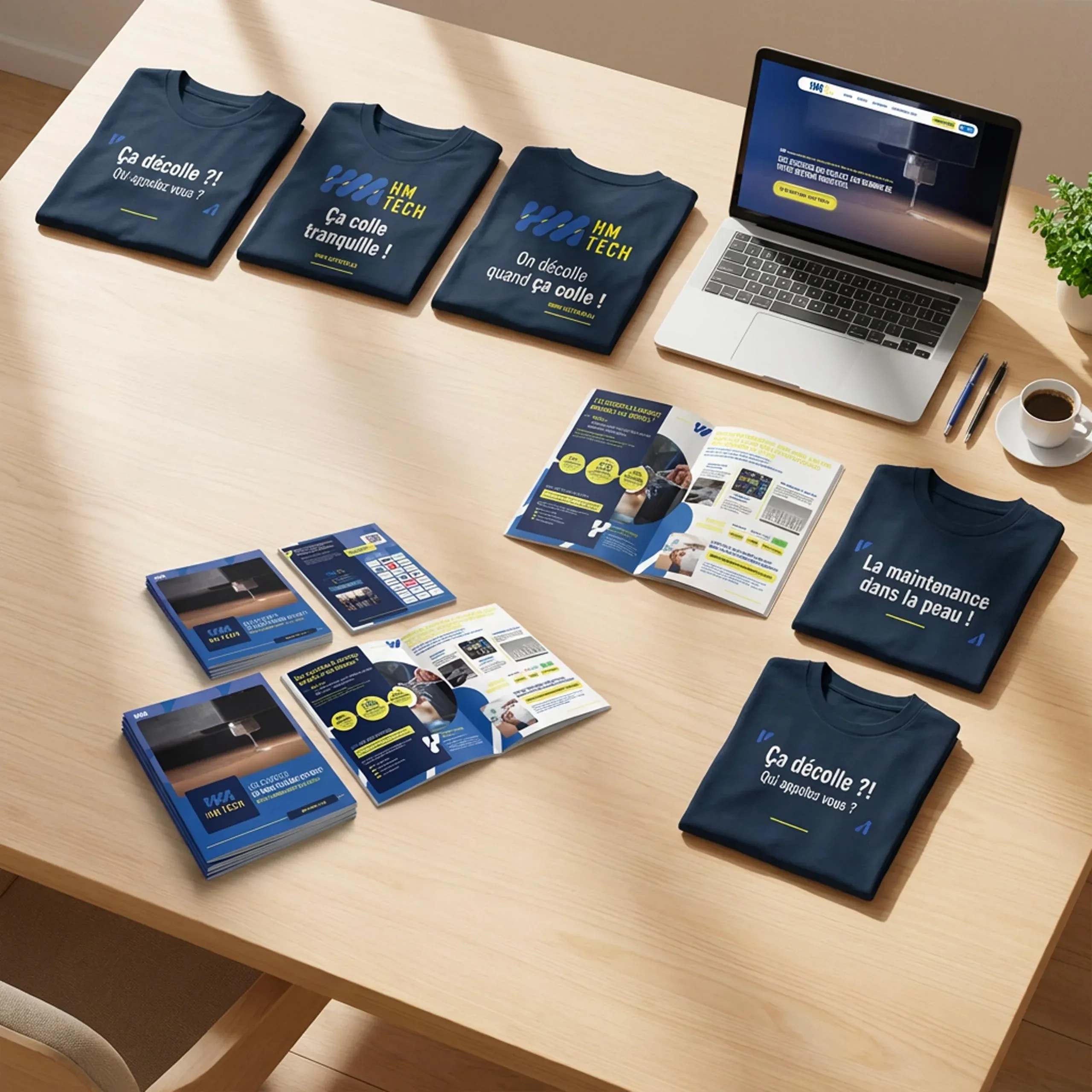
HM Tech sells, installs and services industrial hotmelt gluing systems, and supplies the spare parts. For its tenth anniversary, the company asked for a new logo. We rethought all of its communications, right through to a website designed as a sales tool: the first spare parts enquiry came in through the site in under 45 days.
What we saw
The logo wasn’t
the real issue.
Looking at the company from the outside, we saw a mismatch: the brand image, the sales materials and the way the business was presented did not tell the same story. Changing the logo alone would have solved nothing.
The real challenge was to rethink all of its communications.
Our approach
Talk about breakdowns, not machines.
We centred the message on HM Tech’s customers and what they go through when a gluing machine breaks down. The tone blends the seriousness of an industrial company with a warmer, slightly offbeat voice.
What we created
Communications
that finally tell the same story everywhere.
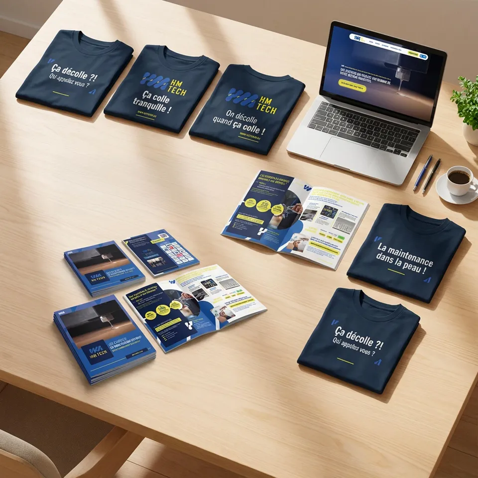
Logo and visual identity
A blue and yellow-green palette, and typography built on Atrament.
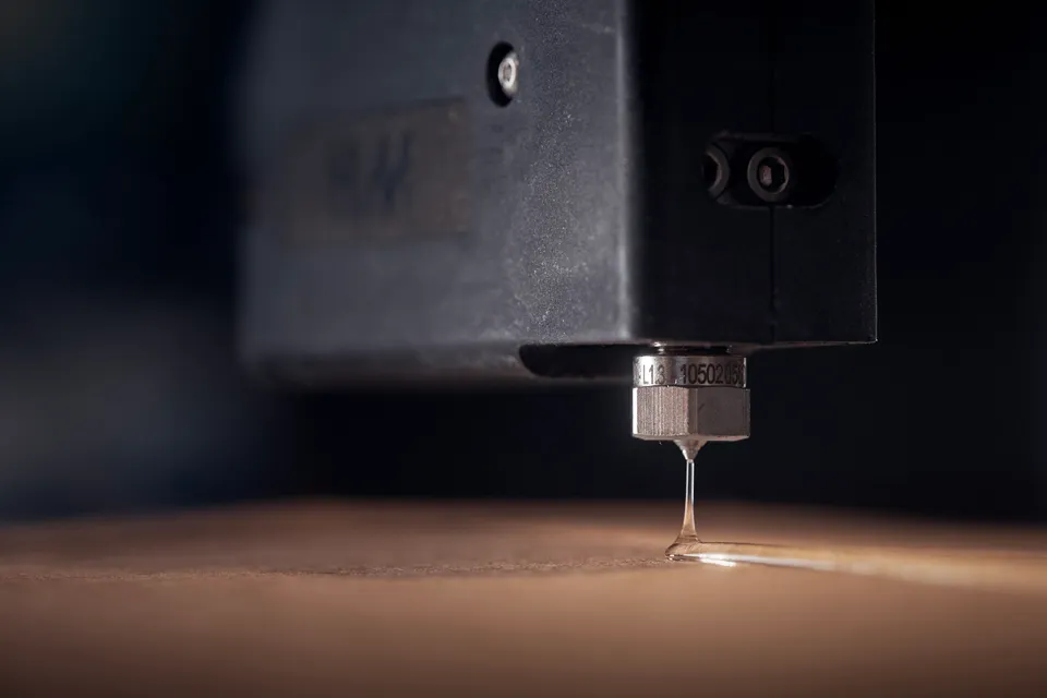
Photo direction
Choosing the photographer and directing the industrial shoot.
Website
Designed as a genuine sales tool, not just a shop window, with SEO work.
Interactive greetings card
Sent by email to announce the new identity.
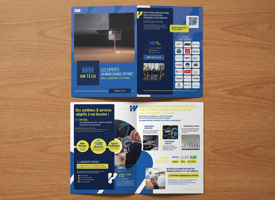
Sales brochure
The same message on paper, for meetings.
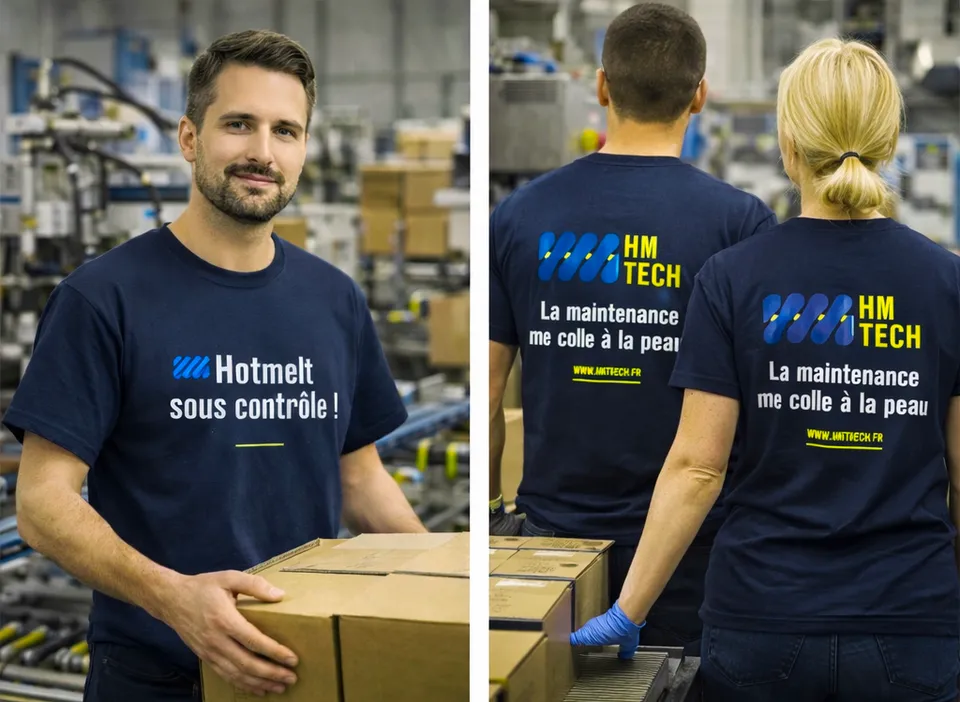
T-shirts and calendars
For customers and for technicians in the field.
The result
< 45 days
to receive the first spare parts enquiry through the website. Something that had never happened before.
“The website was designed as a genuine sales tool, not just a shop window.”
HM Tech’s management fully recognise themselves in the new identity.
Visit the HM Tech website →
Do your communications tell the same story everywhere?
In 20 minutes, we look together at where your customer journey is costing you time or customers.
Book a free callFree · 20 minutes · no commitment