
5 signs your visual identity no longer fits your business
By Ludwig · 25 March 2026 · updated on 20 October 2026
In short
A visual identity doesn't age all at once. It drifts little by little, because your positioning has changed, your sector has evolved or your media are no longer the same. Your clients sense the drift before you do: here are five signs to spot it, and to know where to start.
Does your identity still say what your business does today?
Your image tells the story of yesterday's business
Do your recent materials all look alike?
Your identity is scattering in everyday use
Your identity still holds up
Why you're the last to see it
You see your logo every day. So do your staff. That familiarity makes the drift almost invisible from the inside. Your prospect, on the other hand, discovers your identity with no habit and no indulgence. What they notice in three seconds, you may have stopped seeing years ago.
“A visual identity ages in silence. Your clients hear it straight away.”
Signs 1 and 2: your image blurs what you do
Sign 1: your identity doesn't say what you do
A law firm with a light-hearted look, an industrial company with a cosmetics-brand logo: when the visual signal doesn't match the expected category, the prospect hesitates. A micro-friction, barely conscious, that slows understanding and chips away at trust. They won't be able to say why. They'll simply go elsewhere.
Sign 2: you look like your competitors
Memory retains what stands out. Fiduciary firms all in navy blue, HR consultancies with the same clean typefaces… When your identity blends into your sector's, it stops being a landmark. It becomes background.
Fiduciaire Dupraz SA, your trusted partner since 1992
Our servicesNavy blue, a handshake photo: visitors think they are looking at the site they just left, and remember neither.
Clear figures for confident decisions
Book an appointmentA colour all its own, a direct tone: visitors know they have changed sites, and remember which one.
Signs 3 and 4: times and screens have changed
Sign 3: your identity hasn't moved in seven years
A sector's codes evolve, more slowly than fashion but surely. In finance, identities have become more approachable without losing rigour. In healthcare, clinical white is giving way to warmer palettes. An identity left behind ends up suggesting a business that is “outdated” or “not very committed”, even to clients who couldn't put that feeling into words.
Sign 4: it struggles on your current media
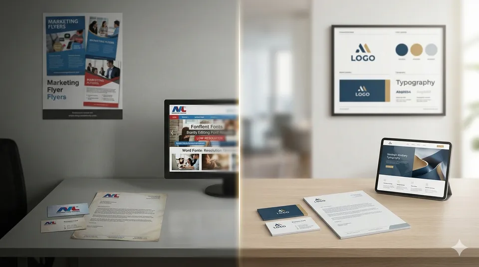
A logo designed for a business card becomes illegible as a browser tab icon. A colour chosen for print shifts on screen. A typeface that looks elegant on paper blurs on mobile. With every new format, the identity fragments a little more, and your client no longer connects your email, your LinkedIn profile and your PDF proposal.
Hard to judge your identity with fresh eyes?
That's normal: you see it every day. We look at it with you through fresh eyes, in 20 minutes.
Sign 5: an identity poorly applied in-house
The last sign has nothing to do with design, and everything to do with use. A presentation built with whatever font “was available”. A supplier who receives your logo with no guidelines and adapts it their own way. A home-made flyer for the open day. Every deviation breaks the repetition that lets your clients recognise you.
What the five signs have in common
Friction, confusion with competitors, a dated image, fragmentation, dispersion: the mechanisms differ, the result is the same. Your audience sees you, but doesn't remember you… or remembers the wrong image. And a brand that is poorly remembered has to introduce itself all over again at every encounter.
Getting back to a consistent identity
How to build a visual identity that looks like itself across all your media, and lasts.
Evolve without chasing fashion
Read trends as clues
Changes in your sector are not orders. They are clues about what your audience now expects from a business like yours. A joinery, a physiotherapy practice and a B2B industrial company don't share the same reference points. It is against yours that you need to position yourself.
The right question
Not “is it on trend?” but “does this signal match what my clients expect today?”. The two answers often diverge, and it's the second one that counts. Evolving doesn't mean throwing everything out: the Swiss market values longevity, so keep what makes you recognisable.
Does your visual identity still fit your business?
Open your website, your latest proposal and three competitors' websites, and tick what is true:
Your priority: clarity. Check that your shapes, colours and images really evoke what you do.
Your priority: difference. Identify the codes your sector shares and choose the ones you break away from.
Your priority: an update. Evolve it in small steps, keeping what makes you recognisable.
Your priority: variations. Plan a simplified version of the logo and colours designed for screens.
Your priority: application. Share clear brand guidelines and ready-to-use templates.
Your identity keeps pace with your business. Keep this test to hand: it is worth repeating every year.
Your priority: clarity. Check that your shapes, colours and images really evoke what you do.
Has your identity fallen behind?
We evolve it from your current positioning, keeping what makes you recognisable.
A visual identity doesn't go out of style overnight. It drifts. Better to notice before your clients do.