
How to create a consistent visual identity for a business in Switzerland
By Ludwig · 25 March 2026 · updated on 20 October 2026
In short
Your customers remember what they recognise, and they recognise what they have already seen in the same form. A consistent visual identity repeats the same signals, aligned with what you do, at every touchpoint. In French-speaking Switzerland it also has to last: visual stability is readily taken as a sign of reliability.
Do your last five pieces of material look like they come from the same company?
Every piece starts from scratch
Does your identity say something about your line of work?
It is consistent, but silent
Your identity takes root in your customers' memory
Your customers don't memorise, they recognise
Nobody decides to remember a brand. Visual memory works through recognition: the brain notices what comes back, files it, and eventually attaches an impression to it. A consistent identity works with this mechanism. A scattered identity works against it.
Every encounter deepens the trace… or erases it
The first time a prospect comes across your brand, they keep almost nothing. The tenth time, if everything looks alike, they recognise it effortlessly. Familiarity comes before preference: we happily choose what feels familiar. But if your colour changes from one piece to the next, every encounter starts from zero.
“A consistent brand no longer needs to introduce itself. The others start over at every encounter.”
Emotion comes before analysis
Before reading a single word, your prospect already feels something: trust, seriousness, lightness, boldness. That impression comes before reasoning and colours everything that follows. An identity that triggers nothing takes hold nowhere. Choose the emotion you want to create before you choose your colours.
Shapes and colours: a vocabulary to choose with care
Round or angular, people feel it
Rounded shapes suggest closeness and softness. Straight, angular shapes suggest precision and solidity. An accounting firm with rounded shapes feels approachable. The same firm with sharp angles feels rigorous. Neither is wrong. Each serves a different positioning.
Colours carry associations
Blue suggests trust and stability, hence its popularity in finance. Green speaks of nature and balance, red of energy and urgency, black of refinement. These associations vary between cultures, but in French-speaking Switzerland they are stable enough to anticipate… and to avoid sending the wrong signal.

Consistent, yes. But accurate?
A consistent identity is not enough if it does not reflect your real positioning.
Consistency is won on the forgotten materials
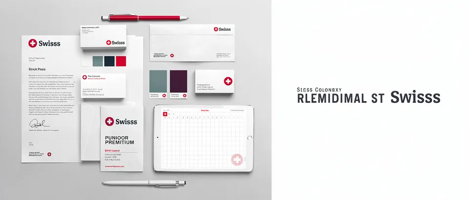
Your website and logo get all the attention. Yet your customers meet you elsewhere too: a business card at a networking drinks event, an email three days later, a quote as a PDF, a van in the car park. Four consistent encounters reinforce the same image four times.
One shade too many is enough
A slightly different blue, a substitute font, a logo stretched to fit a frame… Every deviation breaks the pattern your customer is trying to recognise. Consistency is not a designer's obsession. It is what turns repetition into memory.
Innovative industrial solutions since 1987
Take a brochureVisitors walk past without stopping: nothing reminds them of the website they visited the day before, or the quote they received last month.
Your production lines, without unplanned downtime
Let's talk about your workshopThe colours and typography of the quote sitting on his desk: he recognises the company before reading its name, and walks over.
Are your materials heading in every direction?
Bringing order does not mean redoing everything. We review your materials with you in 20 minutes.
In French-speaking Switzerland, longevity is part of the message
Understated, precise codes
Restraint, precision, legibility: audiences in French-speaking Switzerland are wary of showing off. An identity that tries too hard looks as if it is compensating for something. A clear, well-applied identity inspires trust without raising its voice.
Design for ten years, not for a season
An identity that feels too “on trend” can undermine your credibility. A brand that has stayed stable for years reassures more than one that changes its face with every fashion. Choose shapes, colours and proportions that will still feel right in ten years.
Where to start: intention first, then symbols
Before any design decision, answer two questions. What should your audience feel when they discover your identity? And what image should they keep of you after ten encounters? The answers guide the shapes, then the colours, then the typography, in that order.
Is your identity consistent everywhere?
Spread out your printed and digital materials from the last six months on a table, and tick what is true:
Your priority: colour codes. Define them for screen and print, then share them with all your suppliers.
Your priority: templates. Create ready-to-use templates for your everyday materials.
Your priority: intention. Choose one word, trust, precision or warmth, and test every piece of material against it.
Your priority: longevity. Keep what makes you recognisable, and evolve the rest in small steps.
Your identity is consistent. Now check that it really says what you want it to say: consistency and accuracy do not always go together.
Your priority: colour codes. Define them for screen and print, then share them with all your suppliers.
A brand people recognise everywhere?
We build visual identities designed for all your materials, from your website to your trade fair stand.
Nobody notices a consistent identity. Everyone remembers the brand it carries.