
Logo, brand guidelines, visual identity: what's the real difference?
By Ludwig · 25 March 2026 · updated on 20 October 2026

In short
Logo, brand guidelines and visual identity are three levels of the same thing, and often confused. The logo makes you recognisable, the guidelines set the rules that keep it consistent everywhere, and the visual identity brings together every signal that shapes your brand's image. Knowing where you stand saves you from redesigning your logo when it's the guidelines that are missing.
Could a supplier create something in your brand colours without calling you?
You have a logo, but you're missing the guidelines
Do your photos, videos and website all say the same thing?
Your guidelines don't yet cover the whole identity
You have a visual identity, not just a logo
Three words for one thing? Not quite
“We've redone our visual identity” often means a new logo has been drawn. “We have brand guidelines” sometimes means a single A4 page with two colours and a font. The words get blurred, and so does the work behind them.
What you think you have
Take a joinery firm that has used the same logo for ten years. Blurry on the website, sharp on the business cards, stretched on the van, recoloured by the printer. It thinks it has an identity. What it has is a symbol that every supplier interprets in their own way. The result: customers who struggle to connect the dots. This isn't an aesthetic issue. It's a question of credibility.
A simple hierarchy
The logo is the starting point. The guidelines are the system that frames it. The visual identity is the whole that goes beyond both. Each level includes the one before. Stopping at the first is like laying the first stone and calling it a house.
“A logo without guidelines is a signature everyone forges in their own way.”
The logo: a sign, not a message
A logo is a graphic sign: a symbol, your name in a chosen typeface, or both. Its job is recognition. Seen often enough, it ends up instantly bringing your company to mind.
What it will never do on its own
For a company nobody knows yet, a logo says almost nothing. Everything around it is what gives it meaning. And it won't tell you which font to use in an email, or how to behave on a dark background.
Kind regards, Marc Favre, Menuiserie Favre Sàrl
Visit our websiteBlurry logo, fancy font, three colours seen nowhere else: the client wonders whether they're writing to the company that sent them the quote.
Marc Favre, Workshop Manager · Menuiserie Favre Sàrl
See our latest projectsA sharp logo, the same colour and font as the quote: the client recognises the company before even reading the signature.
Brand guidelines: the rules that make your brand reproducible
Brand guidelines are your brand's reference document. They set the versions of the logo (colour, black and white, on light or dark backgrounds) and the clear space around it. The colours, with exact codes for screen and print. The typefaces for each use. The layout rules.
These aren't creative constraints. They're guarantees: a new designer, a colleague preparing a proposal or a printer can all produce consistent material without having to call.
Logo or guidelines: not sure which is letting you down?
From the inside, the two are easy to confuse. We sort it out with you, in 20 minutes.
What they often leave out
Standard brand guidelines often overlook photo style, the visual tone on social media, and the way the brand moves in a video or on a website. These unregulated areas are precisely the most visible ones.
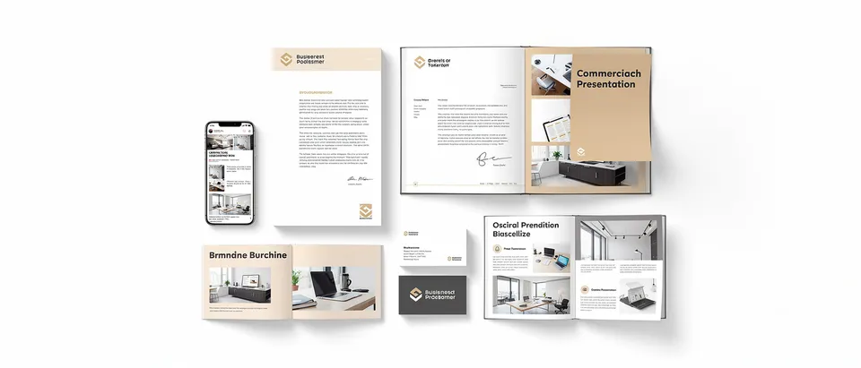
Visual identity: everything your customers see
Visual identity includes the logo and the guidelines, then goes further: it covers every visual point of contact between your brand and your audience.
Greater than the sum of its parts
A recognisable way of framing photos, a way of giving pages room to breathe, a consistent graphic tone from the trade-fair stand to the annual report. Together, they mean customers recognise you before they even see your name.
Motion, the forgotten dimension
How does your logo appear on screen? What pace suits your positioning? As soon as you produce films or an animated website, these questions need answers. Otherwise, every supplier makes them up.
Is your identity still up to date?
The five signs that a visual identity has stopped working for the business.
Where to start, depending on your situation
No logo? Start there, but don't stop there. A logo without guidelines? Your priority is the set of rules. A logo and guidelines, but materials that don't look alike? Redesigning the logo won't help. The real question is whether all your visual signals tell the same story.
What level is your visual identity at?
Gather your five most recent pieces, print and digital, and tick what's true:
Your priority: the logo. Have it properly redrawn in all its versions before anything else.
Your priority: the guidelines. Without them, every supplier reinvents your brand.
Your priority: applying them. Share the guidelines with everyone who produces your materials.
Your priority: the full identity. Extend the guidelines to imagery, motion and digital.
You have a genuine visual identity. Now check that it still reflects your positioning: businesses evolve faster than their guidelines.
Your priority: the logo. Have it properly redrawn in all its versions before anything else.
Logo, guidelines or a full identity?
We start from what you already have and build what's missing, without redoing everything on principle.
A logo gets recognised. An identity gets remembered.