
How to structure your website homepage to win visitors over in 10 seconds
By Ludwig · 24 March 2026 · updated on 20 October 2026
In short
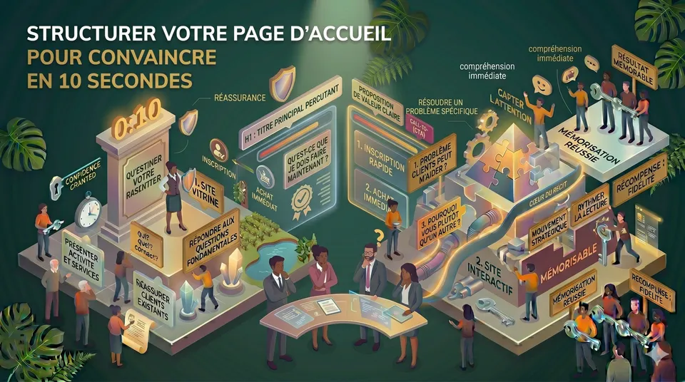
A visitor decides in under ten seconds whether to stay on your site. To win that bet, your homepage must answer three questions straight away: is this for me, does it solve my problem, can I trust them? Your headline, the order of your sections and your call to action do the rest.
Can a stranger tell what you do without scrolling?
Your headline needs rewriting
Can they see what to do next without searching?
Your call to action lacks clarity
Your first screen does its job
Ten seconds, not one more
Visitors don't read your homepage. They scan it. Within seconds, their eye catches a headline, an image, a button… and a decision is made, rarely consciously: am I in the right place?
That decision happens almost entirely above the fold, in what appears without scrolling. If visitors have to scroll down to understand what you do and who you work for, some of them have already left.
Three questions, in this order
Is this site for someone like me? Does it offer what I'm looking for? Can I trust this company? Your homepage must answer all three, in exactly that order. Leave just one unanswered and your visitor will go looking elsewhere for the certainty they didn't find with you.
“A homepage doesn't need to say everything. It needs to say the right thing first.”
The first screen: a headline, a proof, a button
A headline that answers three questions
Your first sentence must say who you work for, what problem you solve and what your clients gain. “We build websites” answers none of the three. “We help SMEs in French-speaking Switzerland turn their website into a tool that persuades” answers all three. Between the two lies the whole difference between a visitor who reads on and one who leaves.
Welcome to our website. Since 2009, we have been putting our expertise at your service.
Learn moreThe visitor can't tell whether this is for them, or what to do next.
Are your building sites waiting for up-to-date plans? We deliver them within 48 hours.
Get a quote within 24 hoursWho, what problem, what benefit: it's all there, and the next step is clear.
Struggling with your headline?
Summing up your own business in one sentence is rarely easy. We'll find it with you, in 20 minutes.
Proof, visible straight away
A well-known client logo, a verifiable figure, a line from a testimonial: a single element is enough to make your promise credible. Placed on the first screen, it answers the third question before it is even asked.
A button that says what it gives
“Contact us” asks for effort. “Get a review of my homepage” names a benefit. The more precise your button, the more it makes people want to click. Place it at least twice: on the first screen, then at the bottom of the page for those who needed to read everything first.
The rest of the page: a conversation, not a brochure
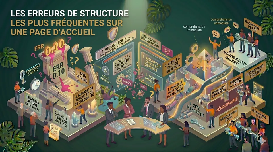
Below the first screen, each section sets up the next. Your visitor first needs to recognise themselves, then believe you can help, understand how you work, see that others have trusted you… and finally know what to do. This order is not a matter of taste. It is the natural path to a decision.
Showcase or interactive?
How you structure your homepage also depends on the type of website you choose.
The two most common mistakes
Starting with the company
Founding date, values, a word from the founder… This information has its place, but further down, or on a dedicated page. At the top of the homepage, it answers a question your visitor hasn't asked yet.
Trying to say everything
Every service described in detail, every section added “so nothing gets left out”, lengthens the path to action. Faced with too much content, visitors don't read more: they scan, retain little, and leave. What you remove from a homepage often matters as much as what you put on it.
Message first, design second: a website designed as a sales tool. Read the case study →
Does your homepage pass the ten-second test?
Open it on your phone, without scrolling, and tick what is true:
Your priority: the headline. Rewrite it starting from your client's problem, not your company.
Your priority: trust. Move a concrete proof up to the first screen.
Your priority: the call to action. Replace “Contact us” with the concrete benefit of getting in touch.
Your priority: trim. Move the details to your service pages and keep only the essentials on the homepage.
Your first screen does its job. If enquiries are still lacking, look at the rest of the customer journey: that's often where visitors drop off.
Your priority: the headline. Rewrite it starting from your client's problem, not your company.
Want an outside view of your homepage?
A free website review, with a reply by email within 48 hours.
A well-built homepage is less like a brochure and more like a conversation. Design isn't what makes the difference. Order is.