
How to explain what you do clearly on your website
By Ludwig · 11 March 2026 · updated on 20 October 2026

In short
A clear website does not say everything you do. It starts from your visitor's problem, spells out what they gain before describing your services, and guides them from one page to the next. The result: your visitor understands in a few seconds why to choose you… and what to do next.
Do visitors recognise their own situation in your opening lines?
Your website talks about you before it talks about them
Do they understand what they gain before reading your list of services?
The benefit is missing
What you do is clearly explained
Your visitors are not thinking about you
When you write your website, the reflex is natural: present your services, your experience, your team, your values. Your visitors, though, arrive with their own question. Their project, their need, their doubt. If your website does not answer it within seconds, they close the tab.
A sentence that says nothing
“An innovative company, we support our clients in their projects with the highest standards.” This sentence describes a posture, not a reality. It does not say who you serve, what problem you solve, or what sets you apart from the firm next door.
Saying everything means saying nothing clearly
The more information a website piles up, the more the essential gets lost. Clarity is an editorial choice: deciding what matters, and in what order to say it. That work always comes before the website.
“Your visitors are not trying to get to know you. They want to know whether you can help them.”
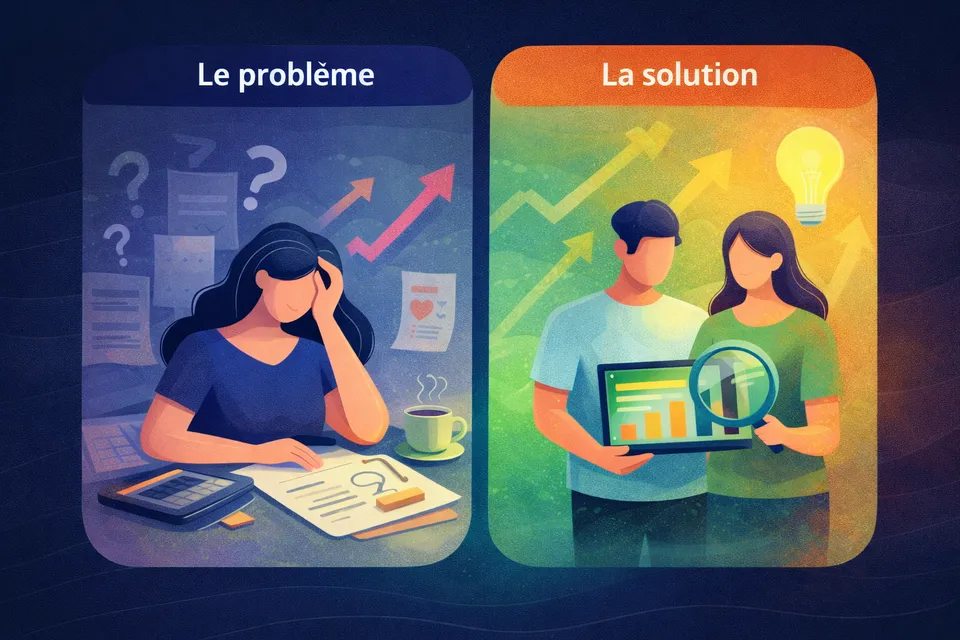
Problem first, service second
Start from what they are going through
Your customers are not there to study your services. They have a problem to solve, a project to move forward. Starting with your services forces them to work out for themselves how you can help. Starting with their situation shows them you understand. That is where trust begins.
Say what they gain
“We produce construction plans” says what you do. “Your project moves forward without you having to coordinate ten different trades” says what your customer gains. Your visitors are asking what is in it for them. Your website has to answer that first.
Our services: preliminary design, planning application, tendering, site management.
See our servicesVisitors read a list of stages. They have no idea what those change for them.
You dream of the house, not the paperwork. We carry your project from the first sketch to the handover of the keys.
Talk about my projectVisitors recognise themselves, understand what they gain, and know what to do next.
Finding it hard to turn your expertise into benefits?
From the inside, everything looks important. Let's sort it out together, in 20 minutes.
Two elements that carry everything else
An opening line that filters
Your first sentence says who you serve, what problem you solve and what changes for your customer. It is not a slogan. It is a clear statement that makes the right visitor think “this is for me”… and tells the wrong one to look elsewhere.
A path that guides
An effective website does not list, it leads: your situation, why it persists, our approach, what you gain, how to get started. Every section has a purpose. None is there to fill the page.
Structure your message before your website
A clear message is not a summary of your services. It is a three-step structure.
The two habits that blur your message
Your industry jargon
Your acronyms and process names seem obvious to you. To your visitors, they are closed doors. An accounting firm that talks about “year-end closing” and the “net tax rate” is right… for its peers. Wherever your prospect is not looking for those terms, use their words instead.
Pages that don't talk to each other
On many websites, the home page promises one thing, the services pages describe another, and the “About” page tells a third story. A clear message holds together from page to page: same positioning, same benefits, same tone. That common thread is what gives your website its power to convince.

A restructured website and a repositioned message that speaks first to the concerns of its industrial audience. Read the case study →
A website that works for you
When your message is structured, your visitors no longer have to dig or guess. They understand what you do, who for, and why you. Then they decide. The design can stay the same: the experience changes completely.
Does your website explain what you do clearly?
Read your website as if you were seeing it for the first time, and tick what is true:
Your priority: flip the point of view. Rewrite your opening line around what your customer is going through.
Your priority: the benefit. Open each service with a sentence that says what your customer gains.
Your priority: vocabulary. Replace jargon with the words your customers use on the phone.
Your priority: the common thread. Put your core message into one sentence, then check that every page carries it forward.
What you do is clear. If enquiries are slow to come, look at the path to the button.
Your priority: flip the point of view. Rewrite your opening line around what your customer is going through.
Is your website understood the first time?
A free website review, with a reply by email within 48 hours.
A clear website does not speak louder than the others. It speaks about the right person first.